 Fund your Account
 Contact Support
 For Institutions
 Honor Elite

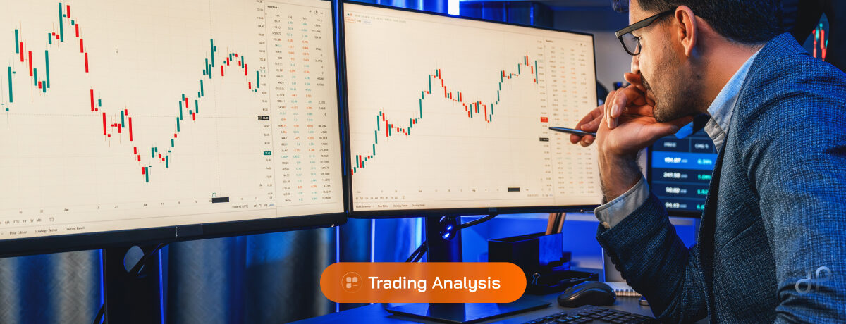
If you’ve ever watched a small forex account double in a day, charts were doing the heavy lifting. These visual representations convert raw price data into actionable patterns that reveal market sentiment and future direction. But charts aren’t just pretty pictures on your screen.
They’re the difference between profitable traders and those burning through accounts on gut feelings. Which chart type fits your style, though? And how do you spot the signals that actually matter?
Table of Contents
- What are Forex Charts?
- Why Forex Charts Matter for Trading Success
- The Three Main Types of Forex Charts
- How to Read Forex Charts Step by Step
- Advanced Chart Reading Techniques
- Key Takeaways
- FAQs
What are Forex Charts?
Most new traders stare at their first forex chart and see chaos. That’s understandable when you’re looking at thousands of price movements compressed into lines, bars, or candlesticks dancing across your monitor.
But here’s what’s really happening: every chart is a visual record of buying and selling decisions made by millions of traders worldwide. The horizontal axis tracks time while the vertical axis shows price levels. According to the Bank for International Settlements 2025 Triennial Survey, daily forex trading volume hit $7.5 trillion. That means every chart you see represents an enormous flow of capital making decisions in real time.
Charts do far more than track prices. They reveal patterns that repeat because human psychology stays consistent across market cycles. Fear still drives selling. Greed still fuels buying rallies. And those emotional extremes leave fingerprints on every chart.
Pattern recognition becomes your edge once you know what to look for. Repetitive formations signal potential price movements before they happen. Trend analysis shows you whether a currency pair is climbing, falling, or stuck in a range. Support and resistance levels mark price zones where buying or selling pressure typically emerges.
Most trading platforms update charts in real time, reflecting live market conditions as they unfold. You can zoom from one-minute intervals for quick scalping plays to monthly views for long-term positioning. The trick is matching your timeframe to your strategy.
Chart Components Every Trader Must Know
Every chart contains essential elements that provide crucial market intelligence. The bid price (what buyers will pay) sits slightly below the ask price (what sellers demand). That gap between them is the spread, and it varies based on market conditions and liquidity.
Volume indicators show how many trades occurred at specific price levels when the data is available. High volume often confirms strong price moves. Low volume might signal weak trends ready to reverse.
Time stamps connect each price movement to real-world events. Economic releases, central bank announcements, or geopolitical shocks all leave their mark at specific moments. That context helps you understand why certain patterns formed and whether they’re likely to continue.
Why Forex Charts Matter for Trading Success
Trading without charts is like driving blindfolded. You might have the world’s best fundamental analysis, but timing your entries and exits requires visual confirmation of where prices are actually moving.
Professional traders spend hours studying chart patterns because they reveal collective market psychology. When a currency pair breaks through resistance, you’re watching thousands of stop-loss orders trigger and momentum traders pile in. That breakout might launch a new trend or trap late buyers in a false move.
Risk management becomes impossible without charts. Where do you place your stop-loss? How do you know when to take profits? These decisions depend on identifying support and resistance zones through technical analysis. You need visual proof of where other traders will likely defend their positions.
Charts also provide emotional discipline. Clear visual frameworks showing trend direction and key levels help you avoid impulsive decisions driven by fear or greed. When your strategy says wait, the chart gives you something concrete to reference instead of second-guessing yourself.
Speed matters too. According to ESMA’s 2025 retail trading report, over 78% of profitable forex traders rely on technical analysis as their primary decision-making tool. Charts let you process market information faster than reading economic reports or news feeds.
The Three Main Types of Forex Charts
Line Charts
Line charts connect closing prices across your selected timeframe, creating smooth curves that highlight general price direction. They strip away market noise to reveal underlying trends without distraction.
Advantages
- Clarity: Long-term trends jump out without visual clutter
- Simplicity: Perfect starting point if other chart types feel overwhelming
- Pattern recognition: Trendlines and support/resistance levels appear clearly
Limitations
- Missing data: Only closing prices visible, not full trading ranges
- Lack of detail: No information about intraday volatility or price gaps
- Limited signals: Fewer trading opportunities than more detailed formats
Line charts work best for spotting major trend changes and drawing clean support/resistance lines. They’re especially useful on longer timeframes where daily fluctuations matter less than overall direction.
Bar Charts
Bar charts display four critical data points for each time period: open, high, low, and close prices (OHLC data). Each bar represents one complete trading session, whether that’s one minute, one hour, or one day.
The vertical line shows the full price range from session high to low. Small horizontal lines mark opening prices (left side) and closing prices (right side). This gives you a complete picture of market activity during each period.
Key features
- Full range visibility: See exactly how far prices moved in both directions
- Opening gaps: Spot when markets gap up or down between sessions
- Volatility measurement: Longer bars indicate higher volatility periods
Bar charts excel at revealing market volatility and potential reversal points. Long upper or lower tails often signal that buyers or sellers tested a price level but couldn’t hold it.
Candlestick Charts
Candlestick charts present identical OHLC data as bar charts but in a more visually intuitive format. The body shows the range between opening and closing prices, while thin lines (wicks or shadows) extend to session highs and lows.
Color coding makes trend direction immediately obvious:
- Green/white candles: Closing price higher than opening (bullish movement)
- Red/black candles: Closing price lower than opening (bearish movement)
- Body size: Larger bodies indicate stronger directional movement
Candlestick patterns form the foundation of technical analysis. Single-candle formations like doji (open and close nearly equal) signal market indecision. Multi-candle patterns like engulfing formations often predict trend reversals.
The visual impact helps you process information faster than other chart types. You instantly see whether buyers or sellers dominated each period and can gauge their conviction based on body sizes and wick lengths.
How to Read Forex Charts Step by Step
Step 1: Identify the Overall Trend
Start by stepping back to see the forest before examining individual trees. Daily or weekly charts reveal whether your currency pair is trending up, down, or moving sideways. Trend direction influences every other decision you’ll make.
Uptrends consist of higher highs and higher lows over time. Each pullback should find support above the previous low. Downtrends show the opposite: lower highs and lower lows, with resistance forming at progressively weaker levels.
Sideways trends bounce between established support and resistance without breaking decisively in either direction. These ranging markets require different strategies than trending conditions.
Step 2: Mark Key Support and Resistance Levels
Support levels are price zones where buying pressure historically emerges, preventing further declines. Resistance areas represent where selling pressure typically appears, capping rallies.
These aren’t exact prices but zones where market participants repeatedly make decisions. The more times a level gets tested without breaking, the stronger it becomes. Think of them as psychological battlegrounds where bulls and bears fight for control.
Round numbers often act as magnetic price levels. Currency pairs frequently pause at clean figures like 1.3000 or 1.2500 because traders naturally gravitate toward these numbers when placing orders.
Step 3: Choose Your Trading Timeframe
Your timeframe must match your trading style and available time. Day traders work with 5-minute to 1-hour charts for quick moves. Swing traders focus on 4-hour to daily charts for multi-day positions.
Multiple timeframe analysis provides essential context. If you’re trading hourly charts, always check the daily timeframe to ensure you’re not fighting the bigger trend. Swimming against higher timeframe currents is a recipe for losses.
Step 4: Look for Entry Signals
Entry signals vary based on your approach, but common methods include:
- Breakouts: Entering when price pierces established support or resistance
- Pullbacks: Buying dips in uptrends or selling rallies in downtrends
- Reversal patterns: Trading against current moves when patterns confirm
Never base trades on single signals. Look for confluence where multiple factors support the same directional bias. The best setups often combine technical patterns with fundamental catalysts.
Advanced Chart Reading Techniques
1. Pattern Recognition Mastery
Chart patterns repeat because human emotions remain constant across market cycles. Fear and greed drive similar reactions whether you’re looking at 1987, 2008, or 2025. Continuation patterns like flags and pennants suggest trends will resume after brief consolidation.
Reversal patterns warn of potential trend changes. Head and shoulders formations, double tops, and triple bottoms appear when current trends start exhausting themselves. These patterns become more reliable after extended moves in one direction.
Patience separates successful pattern traders from the rest. Wait for complete pattern formation before acting. Partial patterns fail far more often than completed ones, so patience protects capital while improving win rates.
2. Volume and Price Relationship
Volume data adds crucial confirmation when available. Rising prices with increasing volume suggest genuine buying interest. Price advances on declining volume might indicate weak moves ready to reverse.
Divergences between price and volume often predict turning points. New highs accompanied by falling volume could signal uptrend exhaustion. Smart money might be distributing while retail traders chase momentum.
3. Market Session Timing
Different sessions create distinct chart characteristics. London hours (3:00-12:00 GMT) typically produce the highest volatility and clearest directional moves. Asian sessions often generate ranging conditions with smaller price swings.
Overlapping sessions create the most significant opportunities. The London-New York overlap generates massive volume and the strongest trending moves. Understanding these rhythms helps you choose appropriate strategies for different times.
Key Takeaways
Charts transform abstract market forces into visual patterns you can analyze and trade. But mastering them requires patience, practice, and realistic expectations about what technical analysis can and cannot do.
- Chart selection matters: Line charts reveal trends clearly, candlesticks show detailed patterns, bar charts provide complete range information
- Multiple timeframes provide context: Check higher timeframes before entering trades to avoid fighting bigger trends
- Pattern patience pays: Wait for complete formations and confirmation signals before risking capital
- Volume validates moves: Use volume data when available to confirm price movements and spot divergences
Chart mastery forms the foundation of successful forex trading, but remember that no pattern or signal guarantees profits. Combine technical analysis with proper risk management and realistic profit expectations for long-term success.
FAQs
Q1. What timeframe should I use for forex chart analysis?
A. Your timeframe should match your trading style and schedule. Scalpers use 1-5 minute charts, day traders focus on 15-minute to 4-hour charts, and swing traders analyze daily to weekly timeframes. Always check higher timeframes for context.
Q2. How do I know if a chart pattern is reliable?
A. Reliable patterns typically form after significant price moves, show clear structure, and appear on higher timeframes. Look for volume confirmation when available and wait for complete pattern formation before trading.
Q3. Can I trade successfully using only line charts?
A. While possible, line charts provide limited information compared to candlestick charts. Most professional traders prefer candlesticks because they show opening prices, full trading ranges, and form recognizable patterns that improve decision-making.
Q4. What’s the difference between support and resistance levels?
A. Support levels are price zones where buying pressure typically emerges, preventing further declines. Resistance levels represent areas where selling pressure appears, capping upward moves. These levels often reverse roles when broken decisively.